Showing posts with label With Pictures. Show all posts

Tuesday, February 26, 2013

An excersize in futility

I'm not really going to say anything about this. Just going to post the art.


Monday, June 11, 2012

Sunday, June 10, 2012

Logo Design Progress

It's about time I updated you on what's going on with Jacci's logo.

Jacci asked me to create a version of my logo that looked more like a melalueca leaf, as apposed to the one I originally had. So this is what I've come up with.


The difference between these three black and white versions is the stroke width of the white in the center of the leaf. Otherwise, they are all the same.

We've been discussing color and she likes the idea of a gold and green color scheme (yellow-green analogous). So I've been playing around with colors and these are what I have so far.


Bright Green and Gold


Dark Blue Green and Dark Gold


Dark Blue Green and Light Green


Dark Green and Light Green


Yellow Green, Dark Green stroke, and Yellow Gold


Jacci sent me an image of a globe and asked if I could make it the dot above the J. I'm hesitant to do this because a globe is a fairly complicated bit of imagery for such a small part of the logo. My fear is that a globe will not scale down nicely making an icon sized version of the logo look bad. This would be a violation of my 7 pillars of good logo design.

Obviously for copyright reasons I can't use the image that she sent me as the dot, but I am going to be creating my own globe and trying to make it VERY simple to lessen scalability issues. I am worried about this idea but what the client wants, the client gets.

Saturday, June 9, 2012

Friday, June 8, 2012

DotD #3

I've made a very small amount of progress on this painting. It still sucks, but I think it looks like it has potential.

Friday, June 1, 2012

DoTD #2

So as I was browsing the web trying to come up with ideas of something to draw I decided that I want to get good at digital painting. This is something that I could REALLY use some work on since my digital painting skills are virtually non-existent.

I found this image that I am using for reference: http://i.ytimg.com/vi/cubdagTiRHE/0.jpg

And since this might as well be my first attempt at trying to paint something in photoshop decently. I'm cheating like crazy. Mr. Missal used to always say that all artists are cheating lying stealers.

Anyways I'm uploading my WIP (work in progress) in place of my DoTD (drawing of the day)


If anyone knows of any quality free tutorials out there for this sort of thing, I'd be greatly appreciative. Thanks in Advance.

Thursday, May 31, 2012

Drawing of the Day

I think I'm going to implement a new section to this blog (it's growing so fast!) called the drawing of the day.

The back story: I had an instructor, Mr. Missal, who says that all it takes to become an extremely skilled at drawing is to draw something every day for about 3 years (similar to the famous quote regarding 5,000 hours to be an expert at anything).  That was always music to my ears as someone who has only been drawing since his senior year in high school and was always competing against fellow classmates (some of whom have been drawing longer than I've been alive). But I never really acted on it anywhere near as much as I should have. I have gotten better, but slowly, very slowly.

The Idea: I am going to spend at least 15 minutes every day drawing something (anything), and upload it to this blog regardless of how embarrassingly bad it is.

The Goals: To embarrass myself into getting better, quicker. To receive creative critiques. To encourage discussion on this blog. To foster an environment where people feel comfortable speaking freely.

So here is today's drawing of the day:
I used this image as reference:  http://www.tortoisetrust.org/articles/snapper_1.jpg

If I don't receive any feedback at all on this I'm going to have to resort to doing something terrible. 

Friday, May 25, 2012

Client Assessment Form / Personality Profile

Earlier I mentioned that I was going to create a Client Assessment Form for the purpose of better understanding my clients and thus helping me to create work for them that they can be happy with. I've created a first draft that's nothing more than a page of questions about the client (general interests etc.) and then it is followed by a True-Colors personality test I found on the web.

Here's a first draft:


Sunday, May 20, 2012

Black and White Logo Progess.

 I was getting a little ahead of myself when I posted that screenshot of me working on the logo in color. I'm not near ready to play with that demon yet. So this is what I have right now. I'm hoping for some legitimate feedback this time.


I've included a 16x16 icon version of each.

Friday, May 18, 2012

Vectors and Why you need them

What is a vector? You may have already heard me or someone else say that you need to build your logos in vectors. You may have heard that vectors allow your artwork to be infinitely expandable. But like most normal people, you are having a hard time processing any of this because you are stuck on the question, "What on Earth is a vector?" Since I am at that time in my design process where I turn my sketch into a computer image, there is no better time for me to explain what a vector is, how they work, and why you need them.

Bitmaps: 

 In order to properly understand what a vector is, you'll first need a lesson on what a bitmap image is. If you know what a .bmp file is, don't let that confuse you. .bmp, stands for bitmap, but bitmap is also a broader term. .jpg, .tiff, .png, .bmp, and .tga are all examples of bitmap images. A bitmap is any image that stores it's data in the form of pixels. All photographs are bitmap images. If you zoom in really close on a photograph, you can see the individual dots of color that make up the image. Bitmaps are great, but they have limitations that make them undesirable for logo design.

Limitations:
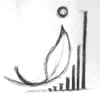
The first limitation is expandability. For example: I have this picture of my drawing. It is a 100x100px .jpg image:


100x100 is really small. I need this to be big enough to fit on my banner that is 900x900 px (a real banner is MUCH more pixels than that but this is the web so I'm using a small example). No problem, I'll just grab my image and re-size it to the scale I need:

Oh no! I've lost all my clarity! The image is pixelated and ugly! What do I do? Well I have 2 choices, I can go back to the original version of my logo, and make modifications to it and save it as a MUCH larger sized .bmp image (if this is the method you choose, you might have to remake the original logo all over again at a larger scale). OR you can convert it to a vector image.

The second limitation of bitmap images is file size. Every pixel on an image is data that has to be stored in the file. Once an image begins to reach very large sizes it takes up a lot of space on your drive and the computer will be very slow at processing any changes you need to make to it. For the sake of expedience and file space, vectors are the better way to go.

 Vector:
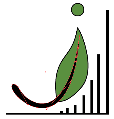
 A vector image doesn't store its data in the form of pixels. It stores it's data in the form of shapes and mathematical relationships.

What you see to the right is a screenshot of the logo I am working on in Abobe Illustrator. Illustrator uses only vectors. The little white dots on the red line are "points" along the "path" (the red line) and the long red lines you see are "handles" which control how the path interpolates between the points. A vector image doesn't need to sample the image into pixels and save every dot of data. It only needs to know where the Points are on each path, how to interpolate the path between the points, and how to "fill" and "stroke" each path. This means an image that is 30,000x30,000 pixels is the same size as an image that is 100x100 pixels when the image is saved as a vector. Vector images are smaller file sizes and they are infinitely expandable without quality loss because all the computer needs to do is take the formula for the image and make it bigger.

Thursday, May 17, 2012

I tried to cheat ...

So I tried to cheat and really quickly post the images of my sketch book drawings really late last night (16th). Then I was going to make this post and go more into detail about them today (17th). Problem is I can't even cheat right. I took too long to get the last post up so it didn't get posted until 12:02 am. Only a few days in and I already messed up my "post every day" pledge. Oh well today still get's two posts to make up for it.

So lets talk about the images I posted. obviously they are all images of the same page of my sketchbook. The sketchbook I used is a 17x14 inch book and the scanner I have is only 8x11 in. So I just scanned several times so I could show the whole page. I thought about cutting them up and splicing them together in one image but that seemed like way too much work.

I felt I had several Ideas worth pursuing with this one page of sketches. When I showed the page to other people they could all point out at least 2 or 3 that they liked (some being picked multiple times by different people). I was surprised when I handed the page to Jaqulyn and in less than a minute picked out one that she was absolutely in love with. I was expecting a, "oh I kinda like this one and this one," lets try some variations of these before going ahead." I was even more surprised to find out that even though she was absolutely in love with the one she picked, there was only one other idea on the page that she even liked. I don't mean to imply that she didn't like my work, she just didn't want any of them as her logo. I was prepared though and for that I am glad. The more choices you can provide, the more likely there is to have a choice that jumps out at the client. Just think, If I hadn't done those 2 drawings that she did like, I would have had a full page of logos that she didn't like. I would have had to start all over again with a new page of logos (which isn't necessarily a bad thing).

So which one did she pick? This one:

This is the logo I will be creating colored digital versions of in the near future. I hope you like it, because I'm going to be doing a lot more posting about it as I continue to work on it.

I am curious, out of all the drawings on the page, which ones would you have chosen and why?

Images of the drawings I did